An icon is the face of your creation in the computer world. Not only does it give a face to your program it also gives an abstract of what your creation stands for. Icons adapt and evolve with your program as they are an essential part of it. In this article, we will take you on a journey to how windows made the windows 10 logo and the windows hero wallpaper.
Being one of the most famous computer platforms in the world windows desktop image is of crucial importance. Windows is used by over a billion people each day belonging to various aspects of society. We can safely say that the default windows desktop image is one of the most seen images online. Therefore it requires the most design attention than everything.

Back In 2015 before the release of Windows 10, the work on this design began. Instead of a CGI based solution, they decided to go with a live composition. The live-action shoot combined various light themes and customization to achieve what we have today as the wallpaper. they wanted to keep the essence of the original windows logo in the image but also give it a modern look.
The images were taken using a 9k Phase One Camera system, they shot over 3000 images with this camera and combined different exposures to get the beautiful lighting effects in the image. The main idea was to make the image somewhat tangible so users can feel it as something in their grasp while also being elegant. By using live images they thought that the design will age slowly with time. Who knew Microsoft was going to make windows 10 stay a long time then.
Also Read: Innovative delivery system in the new windows Update
The Composition:
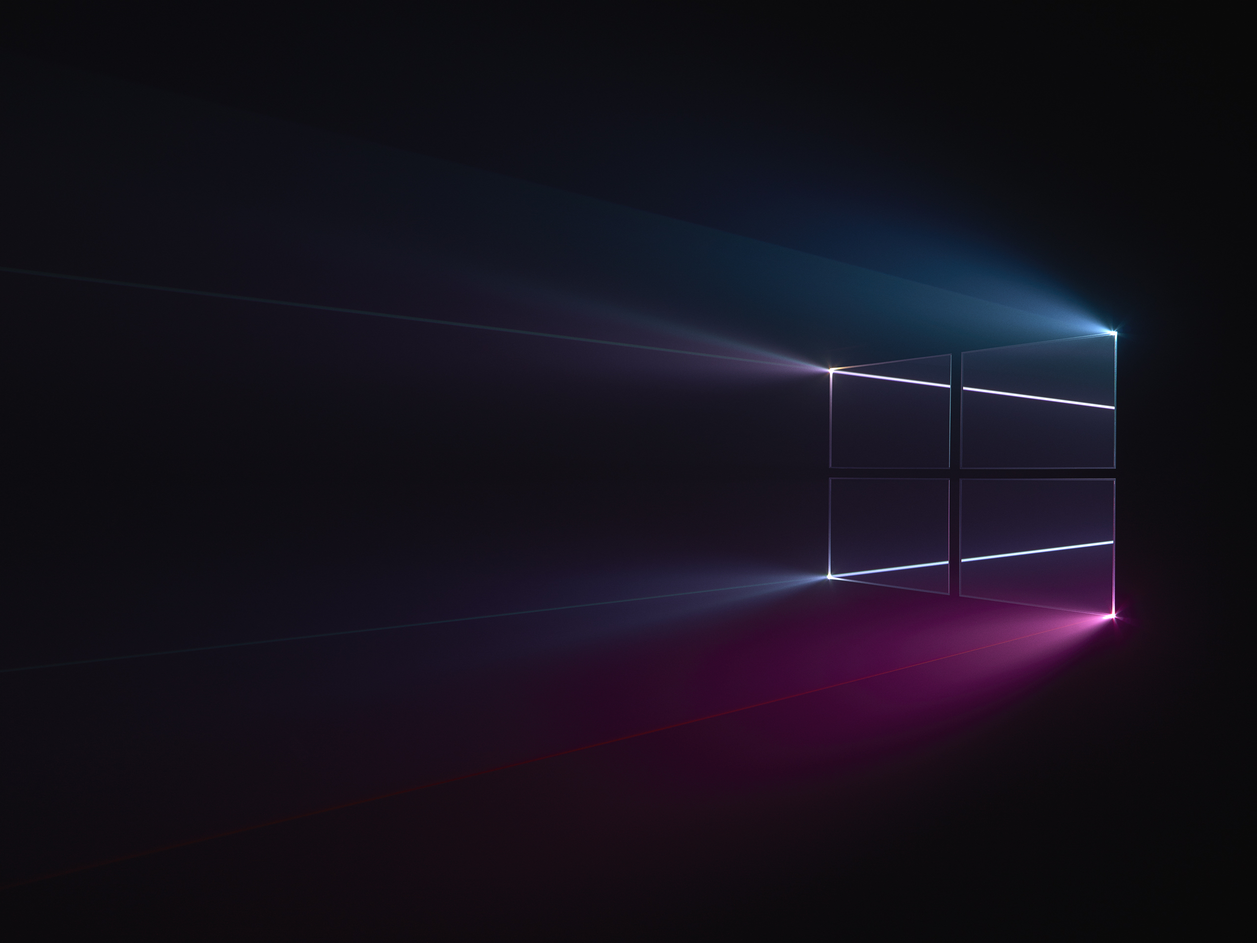
The team used the projector beams cinematic approach in this image. They started off by cutting out the window logo on a piece of cardboard. Later they used this cardboard cutout to make the acrylic windows logo. This created the iconic clear looking windows logo that we see in the image. With the logo made that projected light beams onto it and tried to capture it from off-axis angles. Not only did the camera angle give this image a beautiful depth of field it also gave it some spectral highlights.
Moving on they used different light colors for each of the boxes in the windows logo. The different colors highlight various features and aspects of the logo as well as the ecosystem. To complement these light beams the team also put in some natural fog. The fog gave this image a dark, moody definition as well as a distinctive, provocative take.

With over 3000 images captured it was time to put them into photoshop and make the final composite. They went through all three thousand of these 9k images and picked the ones best for this composite. It started with the plain logo illuminated by the laser lighting. The rest of the layers were then built on this base image. These layers added things like minimal rim-lighting to a multitude of laser lines fanning through the central portions of the logo and lighting up the volumetric haze.
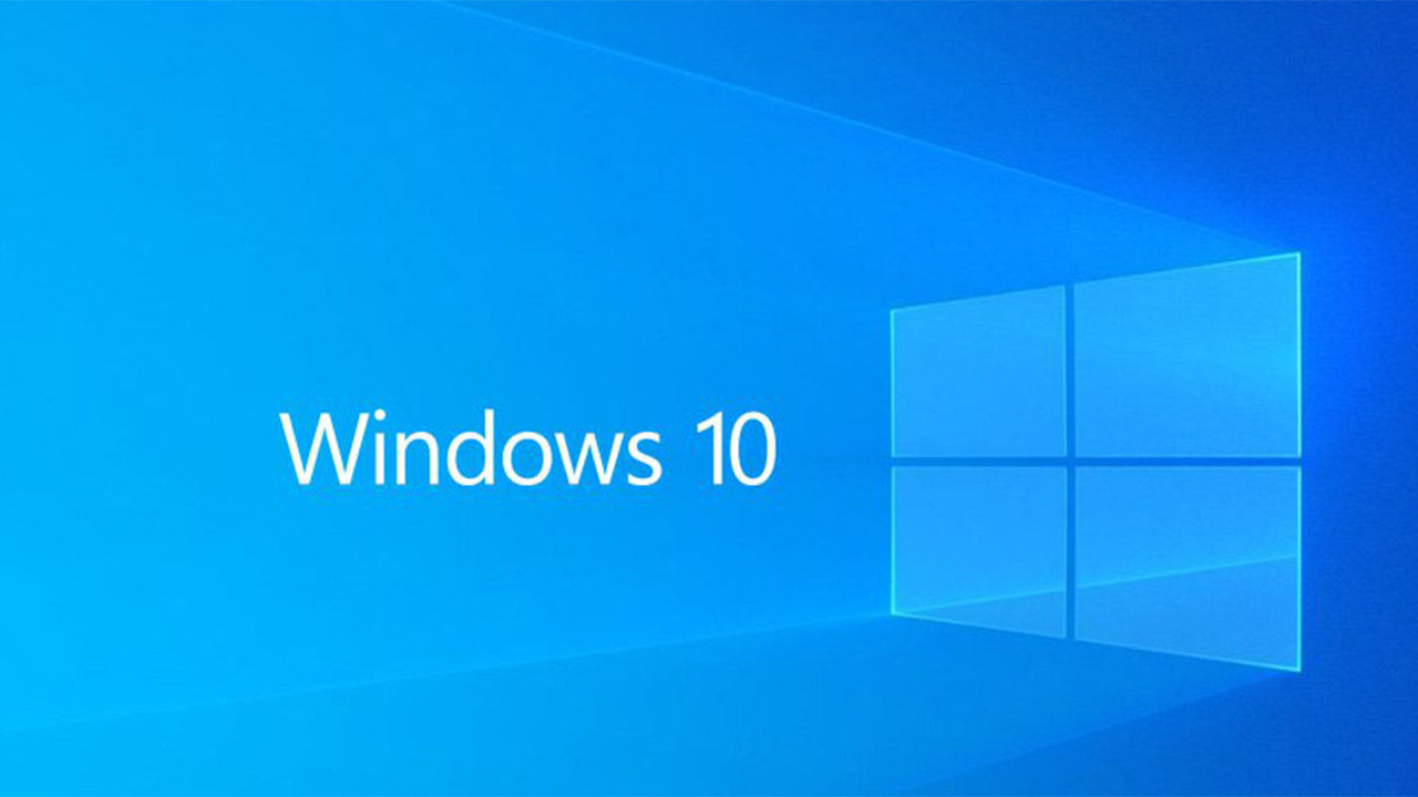
Lastly, they added a few lens flares to the images and brought it down to the blue color scheme which is the theme of Microsoft products. This concluded the production of one of the most famous and elegant looking Microsoft images of all time, the windows 10 desktop logo.
We hope you enjoyed the story behind this image for more details on the process visit this page. Be sure to let us know which windows wallpaper you like the most in the comments below.


