

Earlier this week, Sony finally unveiled the official UI for its upcoming next-gen console, the PlayStation 5. And, now that we’re less than a month away from the launch, we basically know everything about the new consoles. Both of them offer very different things with Xbox focusing on a wider ecosystem while Sony taking the tried and tested approach.
The divergence of strategies extends to the UI of the consoles as well. While Sony has completely redesigned its UI for the PS5, Microsoft has sent out minor tweaks that won’t transform your experience. Having said that, it does feel nicer to have a brand-new UI waiting for you when you power on your shiny new console for the very first time, so kudos to Sony for that.
The UI reveal for the PS5 was rather strange. It was first teased on Twitter, not by the PlayStation Official account but by the fast-food chain Burger King. The teaser video showed off the startup sound for the PS5 followed by a date, which we presumed was the UI reveal date. And, indeed it was with Sony releasing a State of Play video on its official YouTube channel.
The PlayStation 5 UI is a bittersweet deal
At this point, you’re probably wondering why I called the PS5 UI inconsistent in the headline. And, I will explain my case so lower the pitchforks for 5 minutes and hear me out. The UI reveal video started off with the brand-new PS5 control center. This presumably replaces the old side-menu that came up when you held the PS button.
However, this menu seems to be better integrated with your games and includes a bunch of neat stuff in the form of cards. These cards include things like activities, screenshots, news, and more. Honestly, at face value, these features seem useful, and just knowing how much time it would take you to finish something is a godsend.
The control center cards on PS5 are just not good enough
Having said that, all is not well in the world of PlayStation 5 UI design. The cards are big and cover-up almost half of your screen. And, while they do display some information, I feel like Sony could have gotten away with making them smaller or much more focused.
In contrast to the cards themselves, the home screen UI is neat, minimalistic, and presents adequate information for the players at the same time. This is a major step up from the PS4 UI for sure. Additionally, the integration of the PlayStation Store into the UI itself is also going to massively improve the user experience.
However, every time I saw the cards come up on the screen during the presentation, I had the feeling of being overwhelmed by them. The cards just weren’t arranged and focused enough for you to efficiently do things. They took up too much space for the little information they offered and you had to shuffle around a lot to get to the things you wanted.
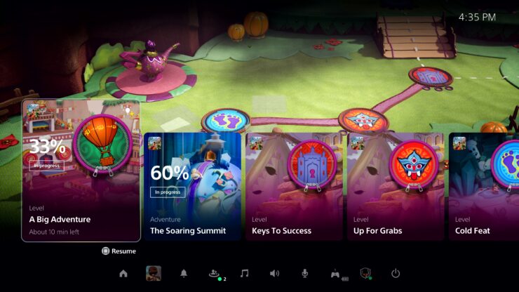
In my opinion, a better solution would have been to divide these cards into explicit categories that you could swipe through from within the control panel. Also, the little icons for the control panel itself are just a downgrade from the super-efficient menu on the PS4.
It just seems like Sony has tried to cram as many features as it can within that little window and as a result, has over-engineered the entire thing. A good UI design has a laser-focus on the things that players are most likely to access. So, cluttering up the most-used menu with too many features will just make the ordeal of navigating through it every time exhausting. And, that is the opposite of what the next-generation represents.
The PlayStation 5 UI reveal showcase ended too soon
One of the most bizarre things that I saw during the PlayStation 5 UI reveal was the presenter continuously telling us that they have limited time. And, despite the showcase being released as a standalone YouTube video, it got cut short at the end due to the arbitrary limitation of time. If Sony is the one making the video and releasing it on its own accord, this just doesn’t make any sense.
Many people wanted to see the new trophies UI or the customization options but we never got to see any of that due to these imaginary time constraints. If the showcase was presented on live TV or during a bigger show then this excuse would have made sense but it is just so bizarre when game companies end their own on-demand videos due to time constraints.
Seriously, what’s up with the mixed messaging from both sides?
So, I guess we’ll see the rest of the PlayStation 5 UI when we get our hands on the console? This has been a common theme with Sony’s messaging leading up to the PlayStation 5. Feeding incomplete information to keep everyone guessing and while it may be good for generating hype, it also ends up generating confusion.
For instance, the PS5 games showcase had a bunch of good stuff in it but Sony omitted some of the biggest details from the show like the pre-order date and the game exclusivity messaging. And, we all know what a mess that created. However, that doesn’t mean that the other side is any better with Microsoft yet to show any truly impressive next-gen experience on its consoles, the Xbox Series X and S.
The lead up to the next-generation consoles has been pretty strange as continue to get drip-fed little nuggets of information from both Sony and Microsoft. Thankfully though, we’re only a little over 3 weeks away from the actual launch so we don’t have to wait long to get all the answers ourselves.
Do you agree with the points I made above about the PS5 UI? If you don’t, then drop a comment below with your reasoning!